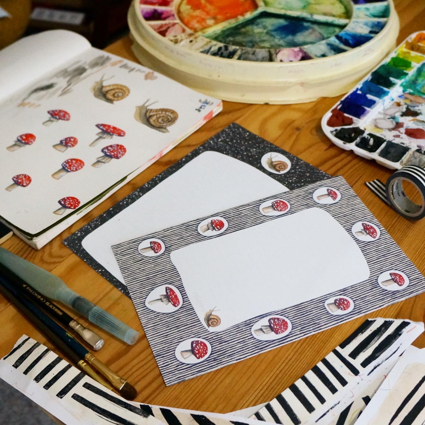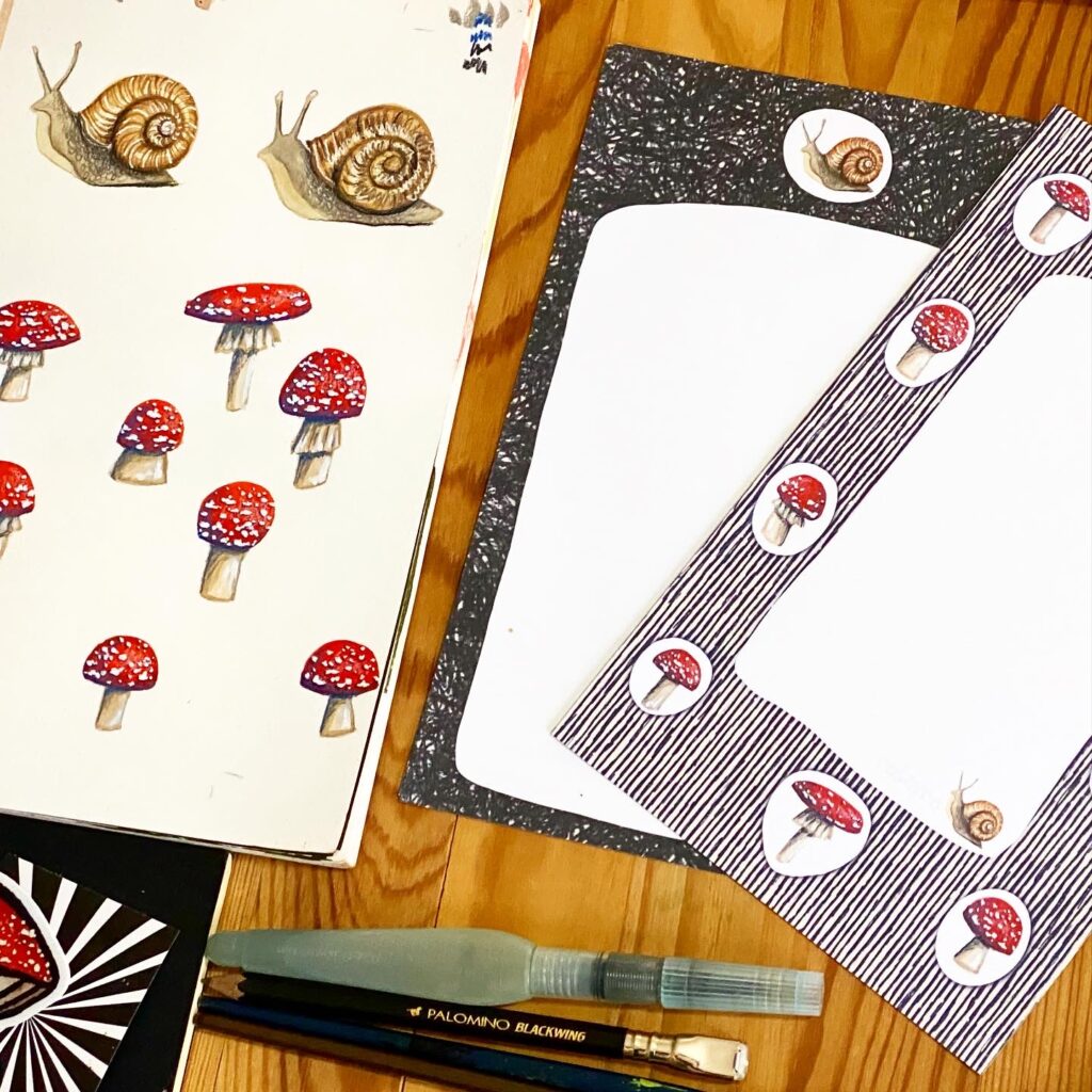
Last fall I had the idea to make a mushroom stationery set. I know, right? What took me so long to have that idea?!
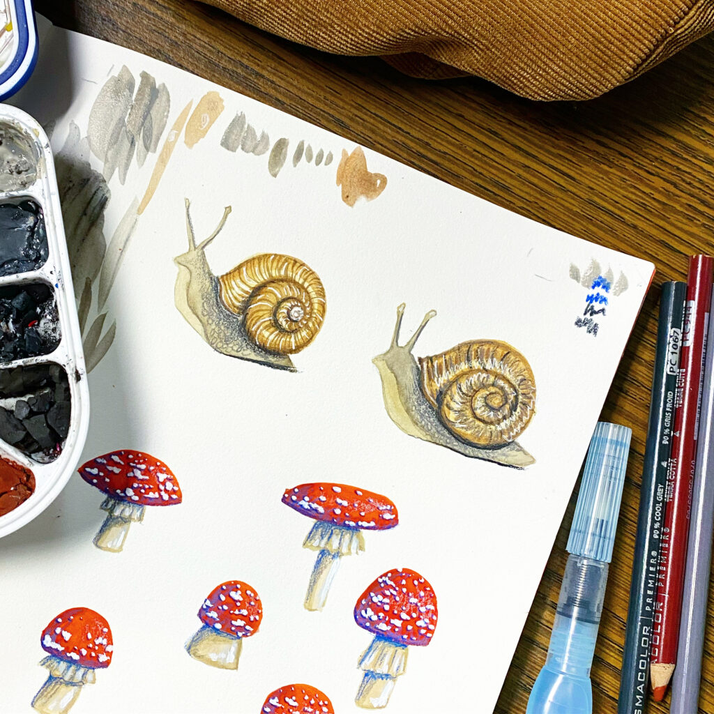
I also wanted to be a little looser and abstract with the colors, so when I illustrated them I used a blue. I really love the way the mushrooms looked with the blue and proceeded to scan and then add them to digital elements I created on my ipad. When I finally got to the printing out samples stage, I realized that the blue made it look really flat. Instead of looking more stylized and funky as I had imagined, they just looked as if my settings weren’t adjusted properly. That might be because of all my years working in the print industry, and I knew it.
I adjusted the blues into blacks and printed out both to compare and contrast. I thought about all the times I see things in stores that are slightly altered and wish the designer had just stuck with what was simple and classic. I always remember a time when shopping with my grandma and all she wanted was a white, collared, button down shirt. We went everywhere! Every shirt we found either had puffy sleeves, or decorated collars, or weird buttons, or something unnecessary printed on it, and on and on.
I still really liked the blue versions, but the black stole my heart, so I proceeded with that.
It’s hard to tell from the pictures I shared, but the letter writing papers have super faint lines to write on.
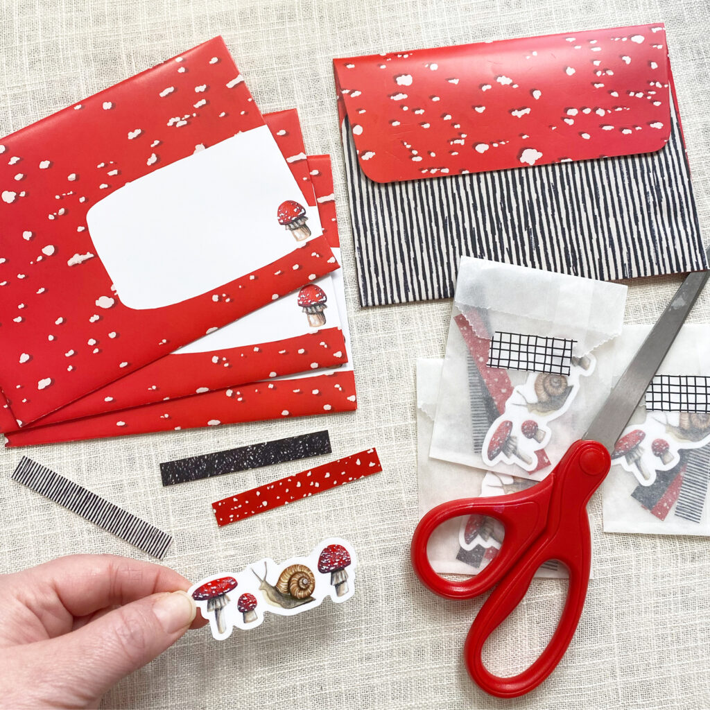
While the majority of my stationery sets are completed with a variety of colorful but blank envelopes, I had the idea of making a matching envelope set and designed a new pattern to accompany the stationery sheets.
I am so in love with that red “polka dot” that mirrors the scales on the cap of the fly algaric mushroom! After I made that I realized this probably wouldn’t just end with a stationery set only. I’ll have to eventually make them into a fabric collection as well.
I placed an order for both parts of the stationery (letter writing papers and envelopes) on the third of January. The stationery sheets arrived right on time and they look great!
But it took extra long for the envelope sheets to arrive and when they finally did, I was so disappointed. Instead of a matte uncoated, thicker paper (almost cardstock weight) like I had ordered and imagined, a thin, slick and glossy paper arrived. I’ve been working with the printer, but they are essentially saying that the paper stock I ordered has a “sheen” and that is just the way things are. I need to send them samples. Regardless of the outcome, it makes me sick to think of all this paper wasted. Having a glossy paper makes it harder to glue the envelopes, shows fingerprints when I touch it (let alone all the marks left when I die cut each sheet to turn it into an envelope) and will make it harder for writers to address (ink smearing).
Overall, the sets look beautiful! I even ordered a few little stickers that could accompany the stationery sets (as seen in the picture featuring the envelopes). I hope I can get the envelope part squared away and add them to my shop soon.
robayre
Hi, I'm Robyn and I was Hatched from a Kinder Surprise Egg. Graphic Designer by day, Maker of things by night. I have worked as a graphic artist professionally since I was 16 years old. Went on to get my Bachelors of Art from NIU. I like to share my Artwork online at flickr.com/photos/robayre and on my own personal website http://www.robayre.com. I also have an online shop http://www.robayre.etsy.com where you can find more of my "crafty" sorts of things, as well as a random piece of artwork here and there. Oh, and I'm also an occasional contributor to Artomat (artomat.org).


